
Table of Contents
ToggleDesign and decor transform empty rooms into spaces that feel like home. A well-designed room does more than look good, it functions well, reflects personality, and creates comfort. Whether someone is starting from scratch or refreshing an existing space, understanding core design principles makes the difference between a room that works and one that falls flat.
Great interior design isn’t about following trends blindly or spending a fortune. It’s about making intentional choices that align with how people actually live. The right color palette sets the mood. Furniture placement affects how a room flows. Textures and accessories add the finishing touches that make a space feel complete.
This guide covers the essential principles of design and decor that anyone can apply. From foundational concepts to practical tips on colors, layout, and accessories, these strategies help create beautiful, functional spaces.
Key Takeaways
- Great design and decor focuses on intentional choices that align with how you actually live, not just following trends.
- Use the 60-30-10 color rule to create balanced rooms: 60% dominant color, 30% secondary, and 10% accent.
- Furniture placement should support natural movement—leave 36 inches for main walkways and float pieces away from walls for a more intentional look.
- Layer textures and textiles (rugs, throws, pillows, curtains) to add warmth, depth, and visual interest to any space.
- Every room needs a focal point—whether it’s a fireplace, statement artwork, or dramatic headboard—to prevent the space from feeling scattered.
- Edit accessories regularly; quality beats quantity, and too many objects create clutter rather than character.
Understanding the Fundamentals of Interior Design
Interior design rests on several key principles that guide every successful project. These fundamentals apply whether decorating a small apartment or a large family home.
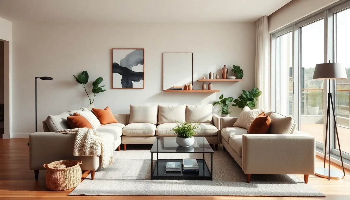
Balance creates visual stability in a room. Symmetrical balance places identical items on each side of a central point, think matching nightstands flanking a bed. Asymmetrical balance uses different objects of similar visual weight, creating a more dynamic look. A large sofa on one side of a room might balance with two chairs on the other.
Proportion and scale matter more than most people realize. Furniture should fit the room’s size. A massive sectional overwhelms a small living room. A tiny coffee table gets lost in a large space. The goal is harmony between objects and their environment.
Rhythm moves the eye through a space. Designers create rhythm through repetition of colors, patterns, or shapes. A blue throw pillow on the sofa, blue artwork on the wall, and blue accents on shelves create visual connection.
Emphasis establishes a focal point. Every room needs one, a fireplace, a statement piece of art, or a dramatic headboard. Without emphasis, a room feels scattered and unfocused.
Unity ties everything together. All design elements should feel connected through a consistent style, color scheme, or theme. Unity doesn’t mean everything matches exactly. It means everything belongs together.
Understanding these design and decor fundamentals provides a framework for making decisions. They’re not rigid rules but guiding principles that help create cohesive, appealing spaces.
Choosing a Color Palette That Works
Color affects mood, perception of space, and overall atmosphere. Selecting the right palette is one of the most important design and decor decisions.
Start with the 60-30-10 rule. This classic formula suggests using a dominant color for 60% of the room (walls and large furniture), a secondary color for 30% (upholstery, curtains, accent furniture), and an accent color for 10% (accessories, artwork, throw pillows). This ratio creates balance without monotony.
Warm colors like reds, oranges, and yellows energize a space. They work well in social areas like living rooms and dining rooms. But, they can make rooms feel smaller, so use them carefully in compact spaces.
Cool colors such as blues, greens, and purples create calm, relaxing environments. They’re ideal for bedrooms and bathrooms. Cool tones also make rooms appear larger and more open.
Neutrals provide flexibility. Whites, grays, beiges, and taupes serve as excellent base colors. They allow accent colors to stand out and make future updates easier.
Consider the room’s natural light when choosing colors. North-facing rooms receive cooler light, so warm colors can counterbalance that effect. South-facing rooms get warm light, making cool colors appear more balanced.
Test colors before committing. Paint large swatches on the wall and observe them at different times of day. Colors shift dramatically under morning versus evening light.
Don’t forget about the ceiling and trim. A slightly lighter shade of the wall color on the ceiling adds depth. Crisp white trim creates clean lines and contrast.
Balancing Furniture and Layout
Furniture placement determines how a room functions. Good layout supports daily activities and encourages natural movement through the space.
Begin by identifying the room’s purpose. A living room might need conversation areas, a TV viewing zone, and a reading nook. A bedroom requires space for sleeping, dressing, and possibly working. Clear purpose guides furniture selection and placement.
Create conversation areas in living spaces. Arrange seating so people can talk comfortably, typically within eight feet of each other. Angle sofas and chairs toward each other rather than all facing the TV.
Leave adequate walkways. Main traffic paths need about 36 inches of clearance. Secondary paths can work with 24 inches. Cramped pathways make rooms feel cluttered and frustrating to use.
Float furniture away from walls when possible. A sofa pulled a few inches into the room often looks better than one pushed against the wall. This creates a more intimate arrangement and makes spaces feel intentional.
Anchor rugs properly. In a living room, the rug should be large enough for at least the front legs of all furniture pieces to rest on it. A too-small rug makes furniture appear disconnected.
Scale matters in design and decor choices. Tall ceilings can handle larger pieces and vertical elements. Low ceilings benefit from lower furniture profiles and horizontal lines.
Don’t overcrowd. Every room needs breathing space. Leave some walls and corners empty. Negative space gives the eye a place to rest and prevents visual overwhelm.
Incorporating Textures and Accessories
Textures and accessories transform basic rooms into interesting, layered spaces. They add personality and make design and decor feel complete.
Mix textures for visual and tactile interest. Combine smooth and rough, soft and hard, matte and shiny. A leather sofa pairs well with a chunky knit throw. A sleek glass table contrasts nicely with a woven basket underneath.
Layering textiles creates depth. Start with a base layer like a rug, add furniture upholstery, then incorporate throws, pillows, and curtains. Each layer adds warmth and dimension.
Accessories tell stories. Books, collected objects, travel souvenirs, and family photos make spaces personal. Group items in odd numbers, three or five objects typically look better than even groupings.
Artwork anchors walls. Hang pieces at eye level, generally with the center at about 57-60 inches from the floor. In a grouping, treat multiple pieces as one unit and center the collection.
Plants bring life to any room. They add color, texture, and improved air quality. Even low-maintenance options like pothos or snake plants make noticeable differences.
Lighting serves as both function and decor. Layer ambient, task, and accent lighting for flexibility. A floor lamp, table lamp, and overhead fixture working together create atmosphere that a single ceiling light cannot match.
Edit accessories regularly. Too many objects create clutter. Rotate seasonal items and remove anything that doesn’t contribute to the overall design. Quality beats quantity.
Mirrors expand space visually and bounce light around rooms. Place them opposite windows to maximize natural light or use them to reflect attractive views.