
Table of Contents
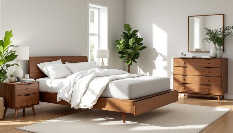
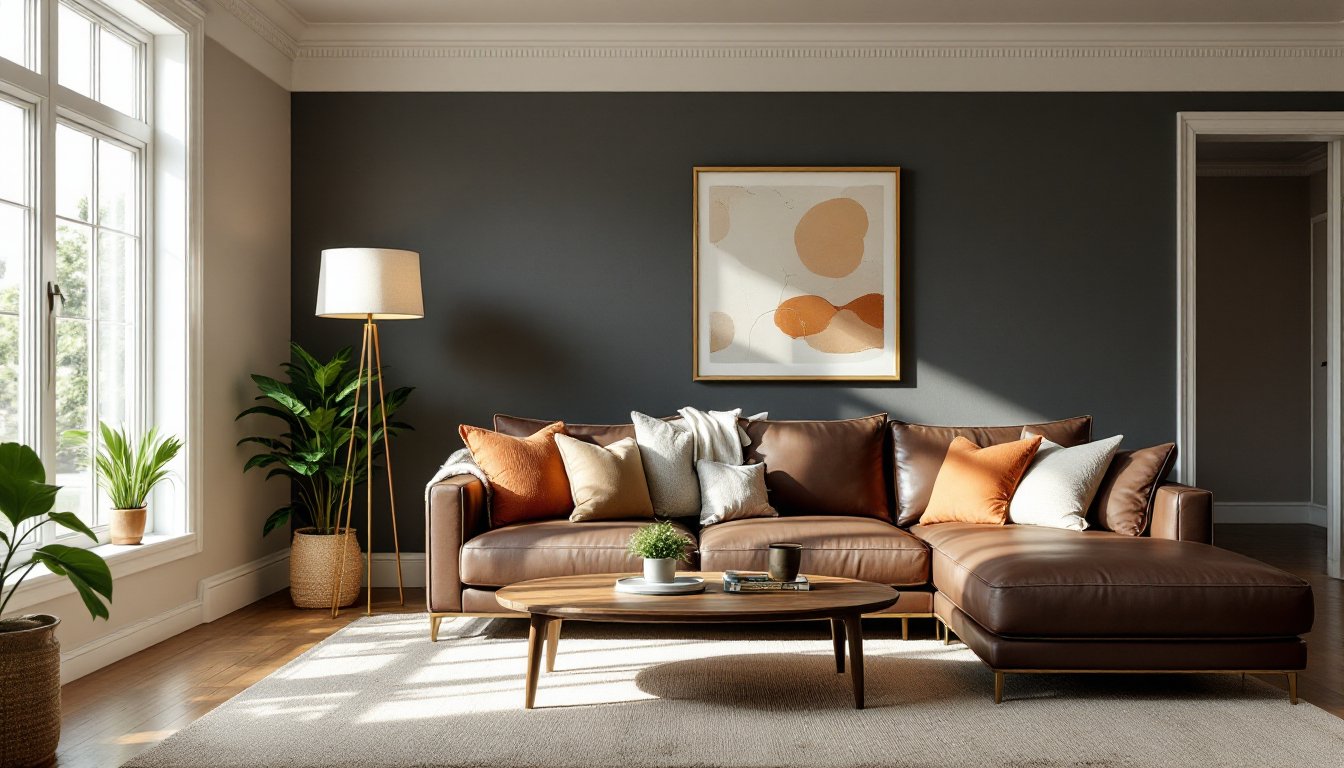
ToggleDark furniture makes a statement, leather sofas, walnut credenzas, espresso coffee tables, but it also demands the right wall color to keep a room from feeling like a cave. Get the paint wrong and the space feels heavy or closed-in. Get it right and those dark pieces anchor the room without overwhelming it. The good news: choosing paint for a living room with dark furniture isn’t about memorizing rules. It’s about understanding how light, contrast, and undertones work together. This guide walks through proven color strategies, specific paint finishes, and real-world considerations for making dark furniture look intentional instead of accidental.
Key Takeaways
- Paint colors for living room walls with dark furniture must balance light reflection and contrast to prevent the space from feeling heavy or cave-like, making color choice as important as furniture selection itself.
- Warm whites and soft grays with LRV values between 55–90 are the safest choices for most living rooms with dark furniture, offering brightness without creating visual tension.
- Bold paint colors like deep blues, forest greens, and warm terracottas can complement dark furniture beautifully in rooms with high ceilings and good natural light, but require careful testing and intentional design planning.
- Eggshell finish is the ideal choice for living room walls with dark furniture, offering the right balance of light reflection, durability, and washability without excessive shine.
- Always test paint samples on multiple walls in different lighting conditions before committing, as undertones and finish sheen significantly affect how wall color interacts with dark furniture and overall room perception.
- Layered lighting, textural variety, and lighter textiles become essential when pairing dark walls with dark furniture to prevent the space from feeling oppressive.
Why Paint Color Matters When You Have Dark Furniture
Dark furniture absorbs light. That’s just physics. A room filled with charcoal upholstery, black wood tables, or deep brown cabinetry needs wall colors that either reflect light back into the space or create enough contrast to define boundaries.
When walls are too dark, furniture and architecture blend together. The eye can’t distinguish where one piece ends and another begins. The result feels flat and confined, especially in rooms with limited natural light.
When walls are too bright without the right undertone, dark furniture looks out of place, like someone dropped heavy pieces into a dollhouse. The mismatch creates visual tension instead of cohesion.
The right wall color serves three functions: it bounces light around dark objects, provides enough contrast to showcase furniture profiles, and ties undertones together so wood, leather, and fabric don’t clash. This balance is why two living rooms with identical furniture can feel completely different depending on paint choice.
Another factor: wall color affects perceived room size. Lighter walls push boundaries outward, making a room feel larger. Darker walls pull inward, which can work if the room is large or if the goal is an intentional, cozy enclosure. The furniture layout also influences how much wall surface remains visible, which changes how dominant paint color feels in the overall scheme.
Light and Neutral Paint Colors That Brighten Dark Furniture
Light neutrals are the safest bet for most living rooms with dark furniture. They maximize reflected light, create breathing room, and let the furniture do the talking.
Warm Whites and Creams
Warm whites, those with yellow, beige, or pink undertones, pair naturally with wood furniture that has warm tones like walnut, cherry, or mahogany. They soften the contrast without creating stark opposition.
Look for whites with an LRV (Light Reflectance Value) between 80 and 90. LRV measures how much light a color reflects on a scale of 0 (absolute black) to 100 (pure white). Colors above 80 feel bright without being clinical.
Popular warm whites include Benjamin Moore White Dove (LRV 83.16), Sherwin-Williams Alabaster (LRV 82), and Behr Swiss Coffee. These aren’t stark: they have enough warmth to complement leather, dark wood grain, and traditional textiles.
Creams sit one step darker and add richness. They work well in rooms with ample natural light or where a cozier feel is desired. Sherwin-Williams Navajo White and Benjamin Moore Manchester Tan both hover around LRV 77–79 and provide warmth without reading as beige.
One caution: test samples on at least two walls. Warm whites can shift yellow or peach depending on lighting. Paint a 2′ x 2′ section and observe it in morning, midday, and evening light before committing to five gallons.
Soft Grays and Greiges
Soft grays offer a modern, cleaner alternative to warm whites. They work especially well with black furniture, gray upholstery, or metal accents. The key is choosing a gray with the right undertone.
Cool grays (those with blue undertones) can feel sterile or cold next to warm wood. Warm grays, grays with beige, taupe, or even slight green undertones, bridge the gap. Sherwin-Williams Repose Gray (LRV 60) and Benjamin Moore Revere Pewter (LRV 55.51) are go-to choices. Revere Pewter leans greige, meaning it’s a hybrid of gray and beige, which prevents it from feeling too cool or too warm.
These mid-tone neutrals (LRV 55–65) provide more contrast against dark furniture than whites do, which can make furniture edges and details pop. They’re also forgiving in rooms with mixed lighting or limited windows.
Greige works when there’s a mix of warm and cool furniture elements, think a dark brown leather sofa paired with a glass coffee table and brushed nickel lamps. The color doesn’t commit fully to either temperature, so it mediates between competing undertones.
Avoid grays below LRV 50 unless the room is large and sun-drenched. Dark walls plus dark furniture requires significant natural light to avoid a dungeon effect.
Bold and Dramatic Paint Colors to Complement Dark Pieces
Not every room needs to play it safe. If the living room has high ceilings, good natural light, or an intentional moody aesthetic, bold wall colors can elevate dark furniture instead of competing with it.
Deep blues, navy, Prussian, or teal, create a sophisticated backdrop for dark wood and black accents. Sherwin-Williams Naval (LRV 4) and Benjamin Moore Hale Navy (LRV 6) are rich, saturated blues that read elegant rather than primary. They work especially well in traditional or transitional spaces where dark furniture has classic lines.
Blues cool down warm wood tones, which can be a benefit if walnut or cherry furniture feels too orange or red in certain light. The contrast is strong but harmonious.
Deep greens, forest, hunter, or emerald, pair naturally with brown and espresso furniture. Green has enough warmth to complement wood grain without clashing. Farrow & Ball Green Smoke and Benjamin Moore Hunter Green both deliver depth without going black. These colors also work well with brass or gold hardware, which often accompanies dark traditional furniture.
Charcoal and near-blacks create a monochromatic scheme when paired with dark furniture. This works if there’s textural variety, velvet vs. leather, matte vs. gloss, wood grain vs. painted finishes. Without texture contrast, the room can feel one-dimensional.
If going dark on the walls, balance is critical. Use lighter textiles (throw pillows, rugs, curtains), and make sure there’s enough artificial and natural light. A dark room with dark furniture and dim lighting feels oppressive. Layered lighting, table lamps, floor lamps, and overhead fixtures with dimmers, becomes non-negotiable.
Bold doesn’t always mean dark. Warm terracotta, burnt orange, or rust can energize a room with dark furniture, especially in mid-century modern or eclectic spaces. These colors have enough saturation to hold their own without overwhelming. Test them carefully, though, they’re trend-forward and may date faster than neutrals. Home design trends often cycle through color palettes, so consider longevity before committing to a strong hue.
How to Choose the Right Paint Finish for Your Living Room
Finish affects how color reads, how light reflects, and how durable the paint is. Living rooms take moderate wear, fingerprints near light switches, scuffs from moving furniture, so finish choice matters.
Flat (matte) finish absorbs light and hides imperfections in drywall. It creates a soft, velvety look that works well on ceilings and low-traffic walls. The downside: it’s not washable. Smudges and marks don’t wipe clean easily. Flat works best in formal living rooms that don’t see heavy use or homes without kids and pets.
Eggshell has a slight sheen, about 10–25% gloss. It reflects a bit more light than flat, making colors feel brighter, and it’s more washable. Eggshell is the default choice for most living room walls. It balances durability and appearance without looking shiny. Most major brands (Benjamin Moore Regal Select, Sherwin-Williams Emerald, Behr Premium Plus Ultra) offer eggshell as a standard interior finish.
Satin has more sheen (25–35% gloss) and is highly washable. It’s often used in kitchens, bathrooms, and high-traffic hallways, but it can work in living rooms if durability is a priority. The increased sheen makes imperfections more visible, though, so wall prep needs to be thorough. Sand any ridges, fill nail holes with lightweight spackle, and prime patched areas with a PVA primer before top-coating.
Semi-gloss and gloss are typically reserved for trim, doors, and cabinetry, not walls. They reflect too much light and highlight every flaw.
One often-overlooked detail: higher-sheen finishes make colors appear lighter and more saturated because they reflect more light. A satin finish of Sherwin-Williams Repose Gray will look different than the same color in flat. Always test the actual finish you plan to use, not just the color.
Coverage matters too. Most paints cover 350–400 square feet per gallon at recommended thickness. A standard living room with 10′ ceilings and four walls (12′ x 15′) has roughly 540 square feet of wall area (accounting for windows and doors). Budget two gallons for two coats, which is standard for full hide and color uniformity. Darker furniture choices often align with broader design strategies, so factor in how wall finish interacts with fabric textures and lighting.
Conclusion
Dark furniture doesn’t limit paint options, it focuses them. Whether leaning into light neutrals for contrast or embracing bold, saturated walls for drama, the key is testing colors in actual room conditions and understanding how finish and light interact. Prime properly, use quality paint, and don’t skip the sample stage. The right wall color makes dark furniture look intentional, anchored, and expensive instead of heavy or out of place.